| < Previous page | Print version | Next page > |
Producing a Graph of the Production Possibility Set
This chapter shows you how to produce and style a graph of the Production Possibility Set (PPS)
The PPS can only be drawn where at most 3 input-output variables in total are involved. The PPS is produced as follows.
Double click PPS in ‘Project Explorer’ and a screen as the one illustrated below will appear .
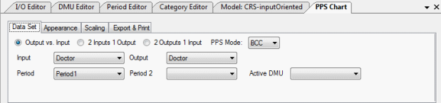
This offers you a number of options for the graph.
Firstly under ‘Data Set’, you can specify whether you wish to draw one input against a single output (labelled Output vs Input) or a graph for 2 inputs against one output or the other way round. You can only draw the latter two types of graphs involving 3 variables under CRS. You need to specify whether the technology is CRS or VRS (BCC) and then specify the input and output variables you wish to plot. The graph will appear as illustrated below.
An example of CRS boundary with single input / single output:
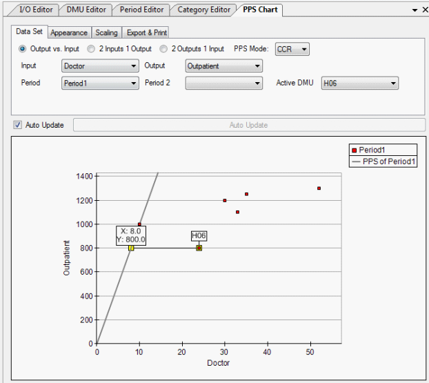
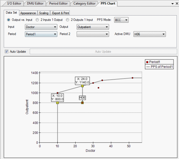
The distance of the ‘active DMU’ from the efficient boundary is plotted.
An example of VRS boundary with single input / single output is shown below.
If you wish to track a specific DMU within the PPS you can specify the DMU concerned as ‘active’.
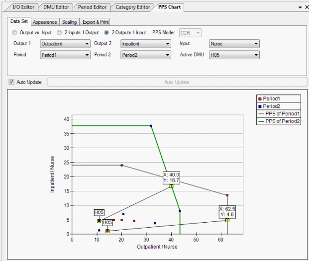
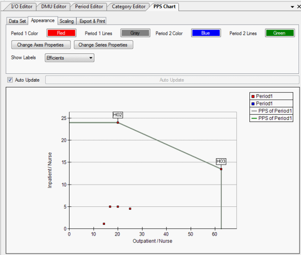
If your data involves more than one period and you wish to see the boundary shift you can specify the two periods of data concerned as in the screenshot below. Note the unit as it changes location between the two periods concerned.
Under Appearance within the PPS Chart menu you can adapt the appearance of the chart according to your own preferences. You can choose the colours you wish to use and specify whether DMU labels should be on display or not and if so whether all DMUs should appear or just those on the efficient boundary. (e.g. see the chart below where only efficient units are shown. )
There are also two other buttons; Change Axes Properties and Change Series Properties which allow you to adapt the graph further.
When you first click on the ‘Change Axes Properties’ icon the following table will show up.
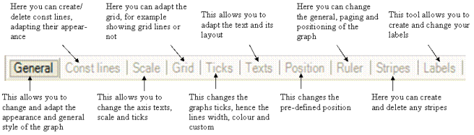
When you have clicked on a heading, a short description about what you can change appears as advice at the bottom of the page for your guidance and help. For example under the sequence ‘Change Axes Properties’ followed by ‘ General’ you can bring up the screen illustrated below which enables a number of changes listed in the right panel.
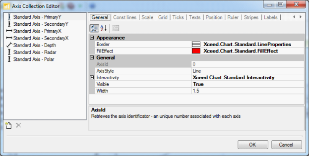
For example the types of axes available are shown on the left panel. Ensure that you are on the correct axis before making any changes. Once you have selected an axis type, the right panel enables you to specify further the style of the axis. For example the ‘Axis Style’, on the left column of the right panel allows you to choose from three different options: Line, Bar or Tube.
As can be see in the screenshot above apart from Axis Style you can change the ‘Border’ and the ‘Fill Effect’. When you single click on either of these it will pull up the following icon
 . If you press on this for the fill effect the following table will appear. This allows you to choose the colour you want to be shown. There is a large number of colours to choose from so you are able to tailor the graph to fit your individual style. . If you press on this for the fill effect the following table will appear. This allows you to choose the colour you want to be shown. There is a large number of colours to choose from so you are able to tailor the graph to fit your individual style. 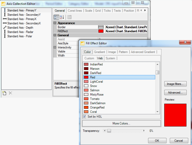
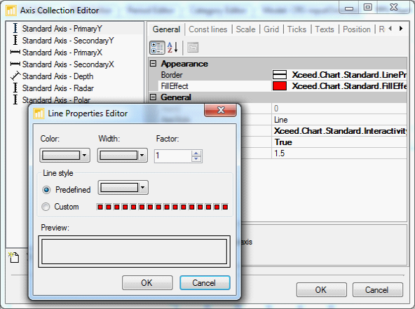
If you then press the same icon for border the following table will be bought up. This allows you to change the colour, width and type of line you wish to use, once again tailoring the graph to your individual needs.
Once you have made all the changes you deem necessary, click OK and then your graph will have adapted.
When using the ‘Change Series Properties’ under PPS you can adapt and change all of the following: General, Labels, Appearance, Markers, Empty Data Points, Legend, Interactivity and Data Points as indicated below.
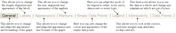
The foregoing controls are self explanatory and the pop up screens in each case indicate the changes to the graph that you can make. For example clicking Change Series Properties followed by Data Points produces a screen such as that illustrated below.
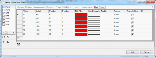
In this table we note:
Fill Effect - You can adapt the fill effect of the graph by double clicking on the coloured box. This will bring up another box allowing you to choose from a variety of colours to find the one which suits your needs best.
Line Properties - This can be changed by single clicking on an individual box and then on the drop down arrow. A box will be bought up allowing you to change the colour, width and custom of the lines.
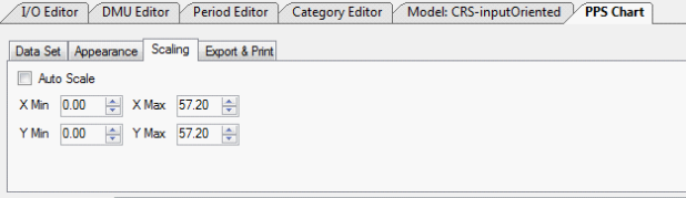
Under ‘Scaling’ within the PPS you can control the scaling of the graph. You can either tick the Auto Scale box which will mean the software will choose the scale it feels is the most appropriate, or if you wanted to look at a specific section or in a specific scale you can change the minimum and the maximum value of each scale so as to examine in more detail a section of the PPS. E.g. see the illustration below.
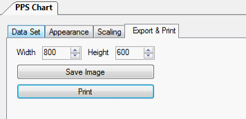
Once your graph is finalised you can use ‘Export and Print’ to change both the height and width of the chart and then there are two options, shown below.
Save Image - This is where you can save the individual graph as a picture on its own, ready to use in any other document or file.
Print - This will automatically print the graph for you. Ensure you printer is fully set up before pressing this button.
 |